01The job
Buyers of electronic components order in bulk, come back often and need to find old orders and quotes fast. The new Vyrian site needed a storefront that makes the catalog easy to browse, a checkout that doesn't lose anyone, and an account area that works like a small dashboard.
That came to 25 page templates. I built them all and wrote the interactions myself: about 3,100 lines of JavaScript and 3,000 lines of CSS.
02Menus that remember
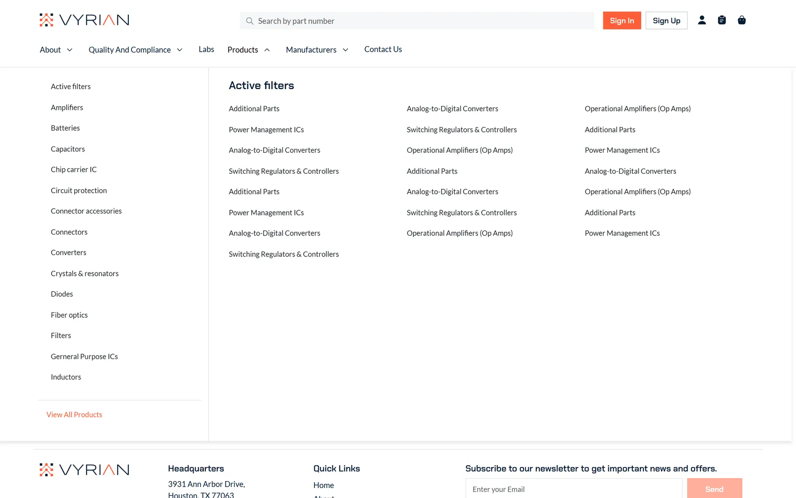
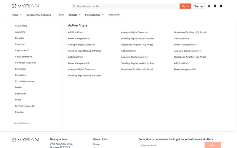
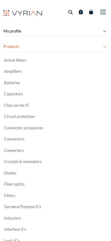
The Products and Manufacturers mega menus list every category in one view. They remember the last category you opened, so going back to the menu takes you straight to where you were. Around them sit dropdowns, an account menu and a collapsible menu for phones.
03A checkout that unlocks step by step
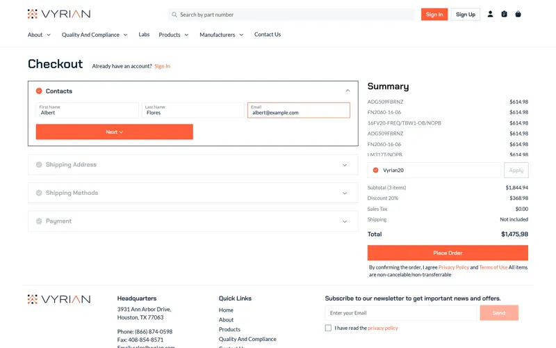
Checkout works for guests and signed-in customers, in four steps: contacts, shipping address, shipping method and payment. Each step opens only when the one before it is valid, so mistakes are caught early instead of at the end.
- Card numbers format themselves as you type, and the CVC has a show and hide toggle.
- PayPal is offered next to card payment.
- Quantities step in packs of 48.
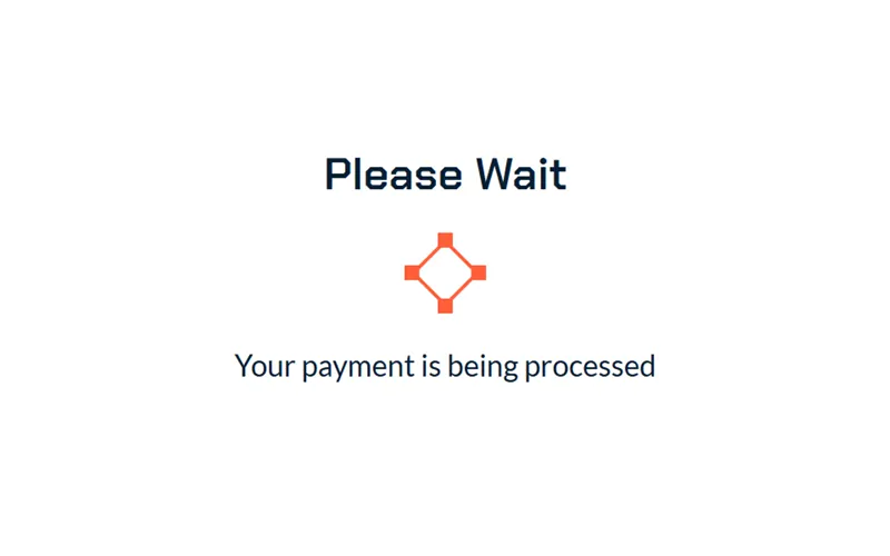
- While the order is placed, an animated Vyrian logo keeps the wait from feeling broken.
04An account area like a small dashboard
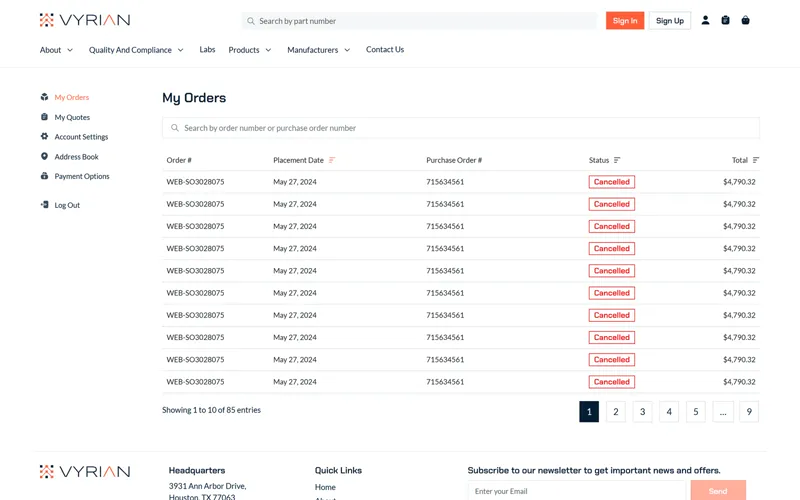
Customers get their own area with orders, quotes, addresses, payment cards and settings.
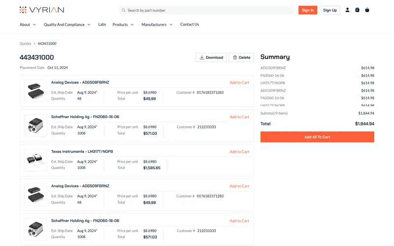
- Order and quote tables are built on DataTables, styled to match the site: they sort, search and page, and open into detail pages.
- A quote can go straight back into the cart, or be downloaded.
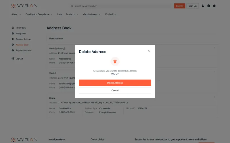
- In the address book, Edit fills the form with the saved address, and Delete asks to confirm first.
- Saved cards, account settings, and friendly empty states when there's nothing to show yet.
05Forms that help
Sign-up, sign-in and settings forms do the small things that save people time:
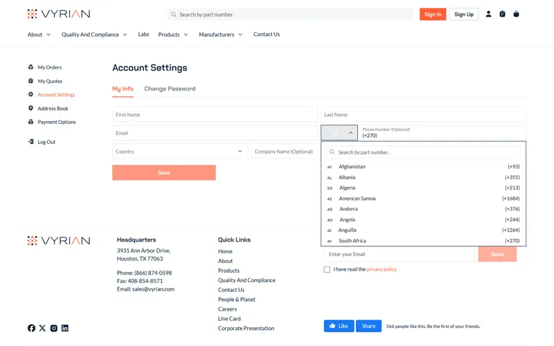
- A searchable country picker, and phone codes with flags.
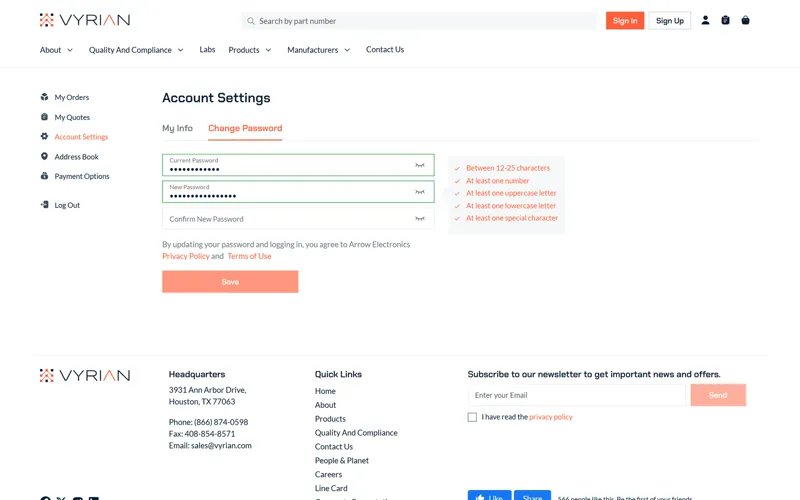
- A live password checklist that ticks off each rule as you type.
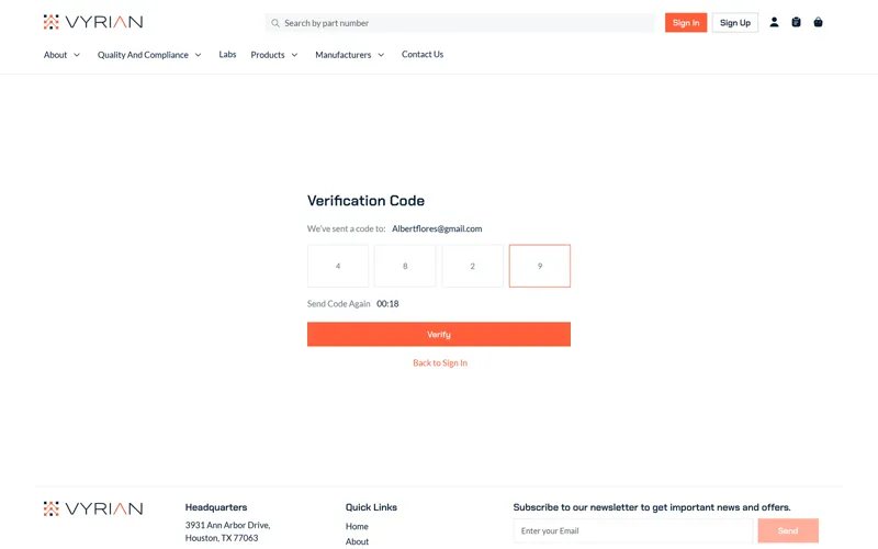
- A six-digit verification code with a resend timer.
- Forgot and reset password flows.
06On phones
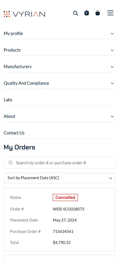
The templates are responsive. On a phone the menu collapses, and wide tables like My orders turn into easy-to-read cards.
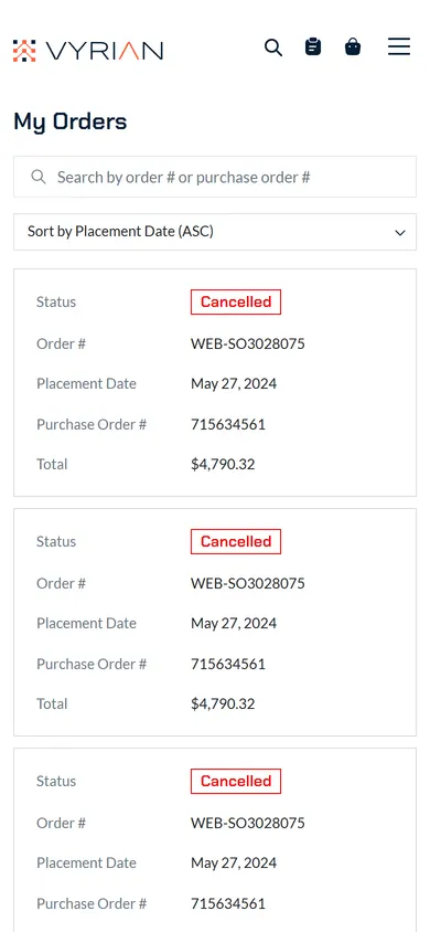
All screens · tap to enlarge